Work and involvement
Strategy, craft,
and what shipped.
Each piece shows where and how I was involved. Strategy lead, creative director, content producer, or all three. Additional work is available on request.
What I bring
Both ends of
the craft.
Selected work
Digital is campaign and social work. Design is art direction, branding, and print.
MasterChef South Africa
Introduced two new content mechanics to the MasterChef SA account: audience-led carousels that made followers the judges, and curiosity-driven video thumbnails built to earn clicks. Both were my original concepts. Both delivered the account’s highest organic numbers of the season. No paid media on any of these.
Piece 1 · Carousel
The idea was to bridge the gap between the show, social media, and the audience by letting them be the judges. Instead of pushing broadcast content, I introduced a format that gave the audience a stake in the outcome. Each slide showed a contestant’s burger. The question was simple: which one would you actually post? That framing made it shareable by design. Highest-performing organic post of the season.
Numbers reflect stats at time of reporting. Live post figures may vary.
Piece 2 · Carousel
Applying the same audience-as-judge mechanic to a cultural icon. The kota is quintessentially South African and carries strong emotional attachment. The format deconstructed it ingredient by ingredient, building tension with each slide. The final slide forced a decision: you have to remove one. That structure drove comments because it gave people something worth arguing about. Same methodology, different cultural entry point.
Numbers reflect stats at time of reporting. Live post figures may vary.
Piece 3 · Video · Curiosity thumbnail
Built around fan favourite Lethiwe. The thumbnail showed him on the floor, ambiguous enough to spark curiosity without revealing anything. Is he celebrating? Is he leaving? The vagueness was deliberate. The goal was to get the click before the viewer knew what they were clicking on. Once inside, the video resolved inside existing show content. No new production required. Just a smarter frame around footage already there.
Numbers reflect stats at time of reporting. Live post figures may vary.
Mother’s Month Campaign
The Mother’s Month campaign was built on a single human truth: moms need to be celebrated, not just marketed to. The entire month was structured around that. Our contribution was the event concept, pitched and delivered with an influencer integration to carry both the live activation and the always-on content that sat around it.
Campaign activation · Competition and event
The Moms in Bloom competition post was designed to build anticipation and drive organic reach before the event. The mechanic was simple: follow, like, reshare, and share a memory. No paid amplification. It reached the brand’s highest single-post organic numbers at the time. The event carousel followed on the day itself, with live posting timed and sequenced deliberately to capture the energy of the brunch as it happened.
Left: Moms in Bloom competition · Right: You Deserve This Seat event carousel. Numbers reflect stats at time of reporting.
Content pillar · Recipe series
A new content pillar I introduced to make the brand present in the day-to-day lives of moms and caregivers, not just during campaign moments. The insight: moms are always looking for quick, easy, relatable ideas that do not feel like advertising. The output was recipe content showcasing product in a lifestyle context, shot in real home environments. I brought in Foodies SA as a content partner to execute it. The concept originated internally. The series is now an ongoing pillar for the brand.
Recipe series in partnership with Foodies SA.
Internal Brand Content
Office culture content built on insider archetypes every agency person recognises instantly. Scripted, produced, and appeared in each piece. Four videos, four strong performances. Most viral: 59.9K views with no paid amplification.
The universal agency experience. Everyone knows that 3pm on a Friday is when productivity ends and survival mode begins. No brief required. It was lived, scripted, shot on a phone, and posted the same week. The caption asked for half-days on Fridays. The comment section agreed.
That one colleague who carries everything to work. Stanley cup, tote bag, handbag, laptop bag, gym bag. The visual was the joke. The concept was: make people tag someone they know immediately. It worked because the archetype is so specific it feels personal.
Built around a universal office archetype. Tag-worthy by design. The goal was reach through recognition. Comments delivered exactly that. The specificity of the character is what makes the format repeatable.
If the contract says 5pm, that is exactly when you leave. Not 5:01. The concept exaggerated a real workplace behaviour that everyone relates to but nobody admits to out loud. The captions and comments section turned it into a conversation.
Video Series, Web Content and Blog Archive
Two original video series built concept to delivery on a minimal budget using a phone and the Adobe suite. Wrote all web content for the Solid Systems website and built the entire blog archive for solidsystems.co.uk. A series of content I wrote for their UK website also lives there, showcasing versatility and an understanding of working with markets abroad. The full content archive covering cybersecurity and productivity lives at solidsystems.co.uk.
The brief was to make cybersecurity accessible and relevant to a non-technical audience. Most cybersecurity content is either too technical or too alarming. The approach was to treat it as lifestyle content: here is what to look for, here is how to protect yourself, here is why it matters. Topics included phishing emails, AI-generated scams, identity theft, and digital hygiene. Shot on a phone, edited using the Adobe suite, with hooks and thumbnails written from scratch.

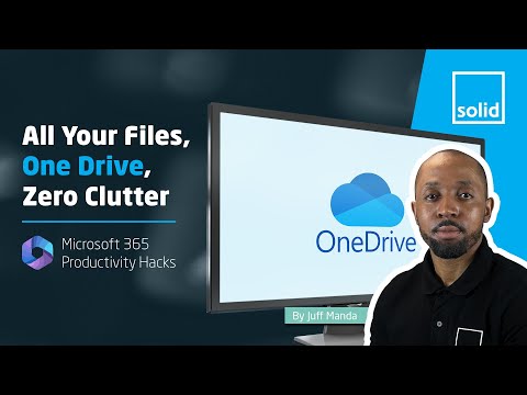
Positioned around the Microsoft ecosystem, this series was built to show business users how to get more done with tools they already have. Microsoft 365, OneDrive, Teams, and productivity workflows were the core subject matter. The format was short, practical, and applied. Same production approach: phone, Adobe suite, original hooks and scripts throughout.
Additional work
GEPF · SodaStream (PepsiCo) · All Gold · Mrs Balls · Knorrox · Nedbank · Wits Business School · Dermopal · Puma Energy. Available on request.
Nedbank
A run of campaign work for one of South Africa’s big four banks, anchored by a single creative idea: the chess move as a metaphor for the right financial decision. The thread runs from the country’s largest agricultural show through to internal culture campaigns, on screen and in market.
Piece 1 · Nampo, agri banking
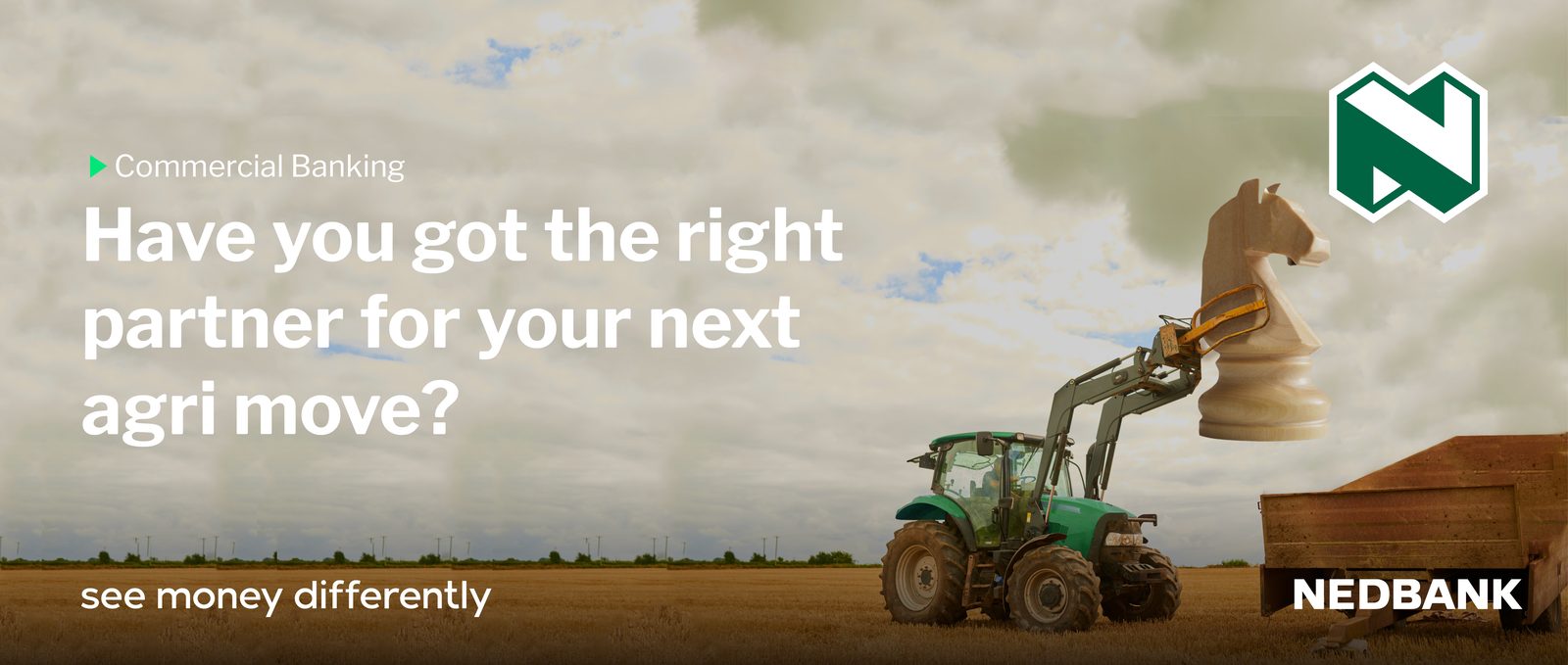
Nampo is the largest agricultural show on the continent, so the work had to speak to farmers in their own language. The tractor lifting a chess knight makes the strategic point without a word of jargon: the right partner is your next big move. Built for out-of-home and press at the show.
Piece 2 · Platinum Collection Team
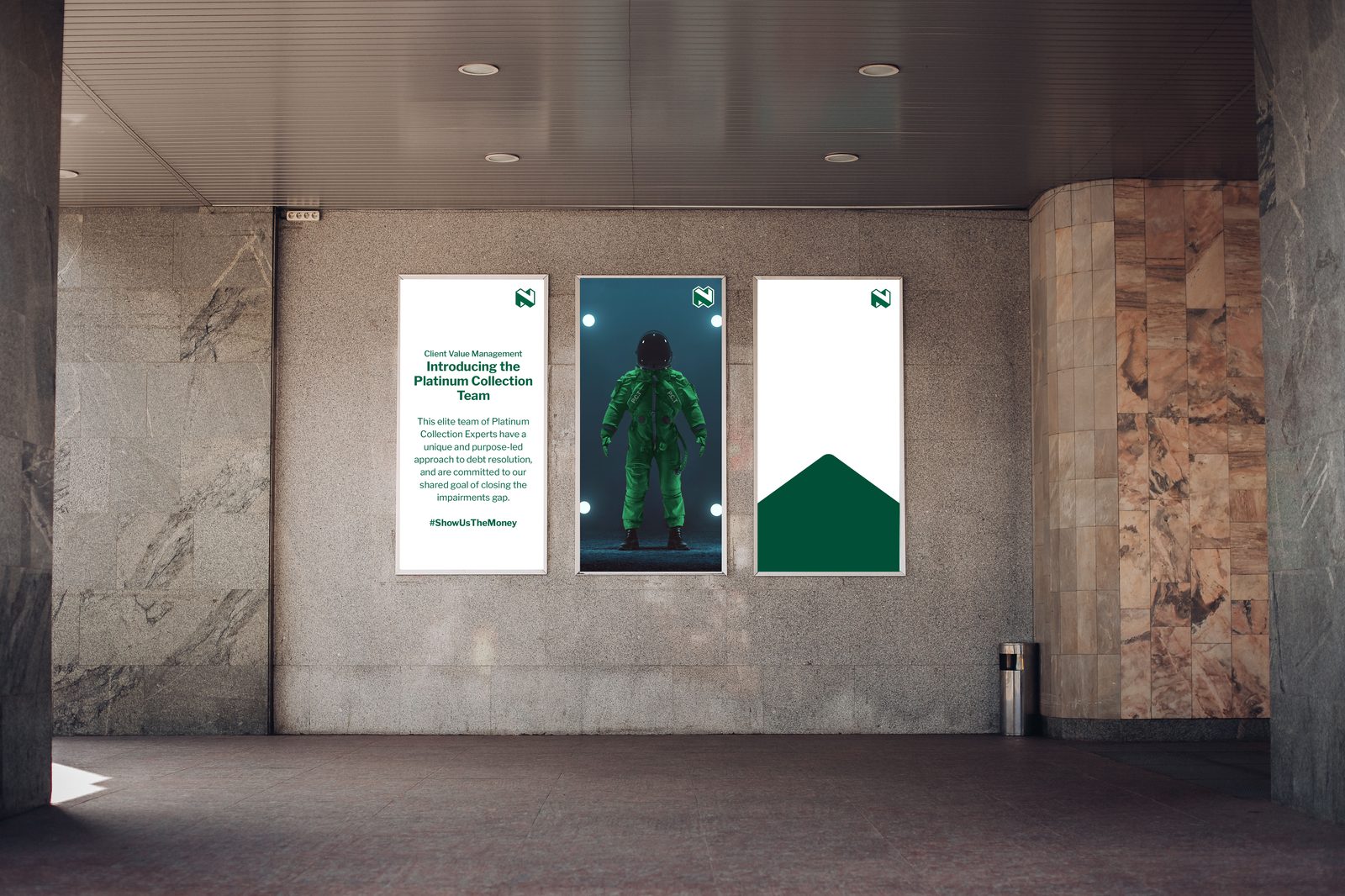
An internal campaign that turned a debt-resolution team into something people wanted to belong to. The astronaut idea framed the Platinum Collection Team as an elite unit closing the impairments gap, with a rallying line, #ShowUsTheMoney, that gave the work a voice.
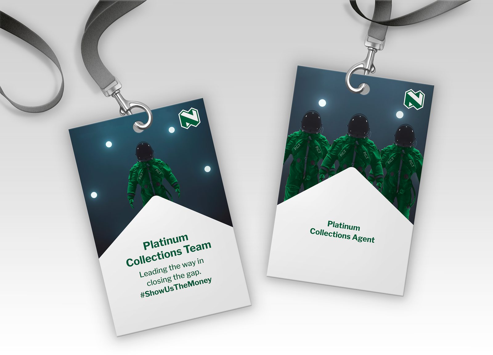
The identity extended to physical kit. Team and agent badges carried the same astronaut world onto lanyards, making the campaign something you wore, not just something you saw.
Campaign reel
Motion work across the Nedbank campaigns, from agri to the Platinum Collection world.
Telkom
Always-on social and campaign work for one of the country’s major networks. The brief was range: move from pop-culture moments like Comic Con to prepaid value messaging to interactive mechanics, all unmistakably Telkom, all built to perform in a fast feed.
Piece 1 · Comic Con Africa
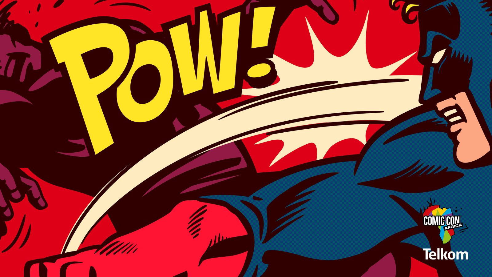
As a Comic Con Africa partner, Telkom needed to show up in the language of the event, not as a sponsor logo. The pop-art panel borrows the codes of the comic page so the brand feels native to the fan, not bolted on.
Piece 2 · Prepaid value
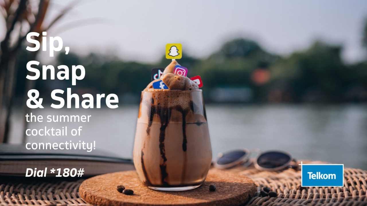
Prepaid data is a commodity, so the work has to sell a feeling. Sip, Snap & Share turned a summer data deal into a mood, social as a seasonal cocktail, with a clear *180# call to action doing the heavy lifting underneath.
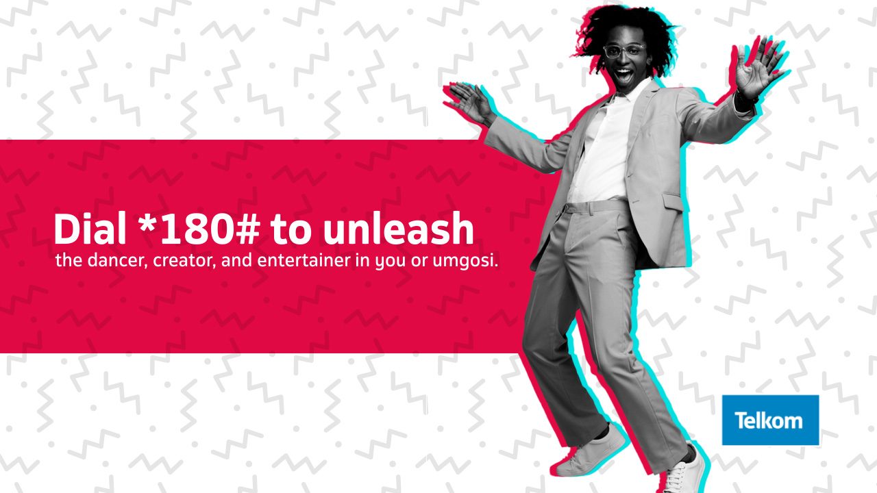
Same campaign, different cut. Dial *180# to unleash the dancer, creator, and entertainer in you leans into local energy and the word umgosi to keep it culturally rooted rather than generic telco.
Piece 3 · Interactive mechanics
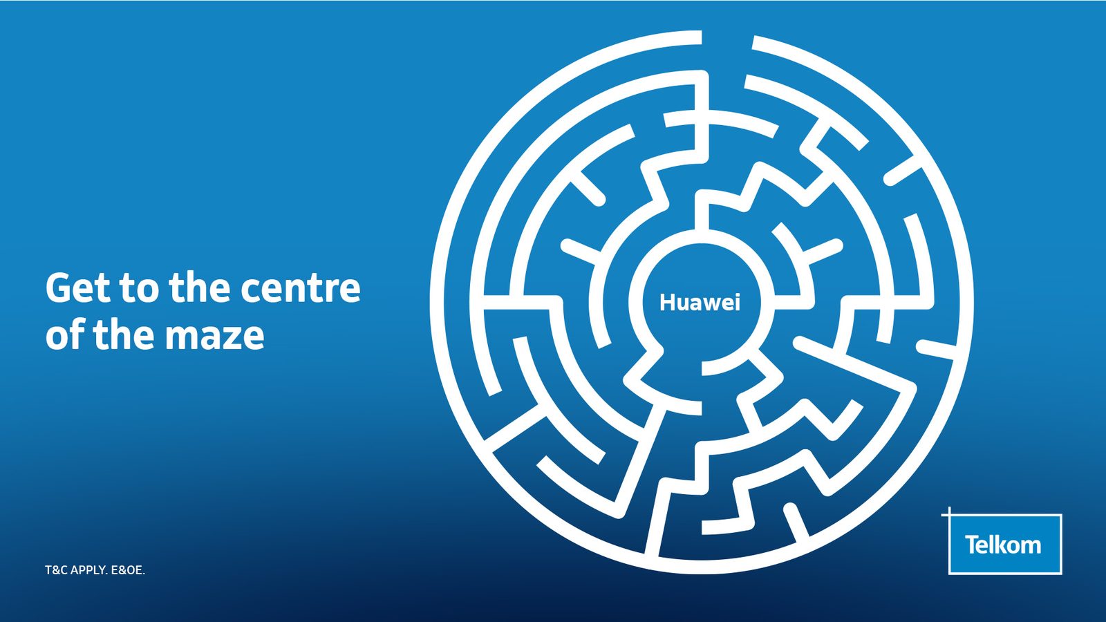
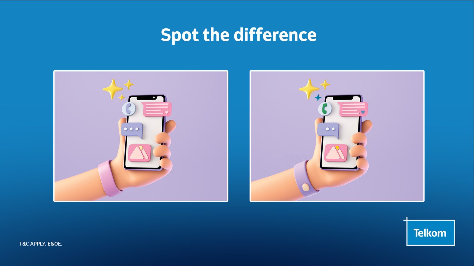
Engagement built into the creative itself. Get to the centre of the maze and Spot the difference are designed to earn comments and dwell time, turning a passive scroll into participation.
Piece 4 · In market on X
The work live on Telkom’s own channel, in the feed it was built for.
Piece 5 · Website
Walkthrough of the Telkom website work, where the same brand discipline carries from a single social post through to the full digital experience.
Garnier
My first television commercial was for Garnier, recutting a one-minute Pure Active ad to thirty seconds for national flighting. Editing for broadcast teaches you to protect the idea while cutting everything that is not the idea. I also worked across the brand’s out-of-home and print.
Piece 1 · Television commercial
Garnier Pure Active, my first television commercial. The job was to recut a one-minute ad to thirty seconds for national flighting without losing the idea. Editing for broadcast is a discipline of subtraction: protect the story beat, cut everything that is not it, and keep the brand landing in the final frame. It aired on the country’s most prominent stations.
Piece 2 · Out-of-home
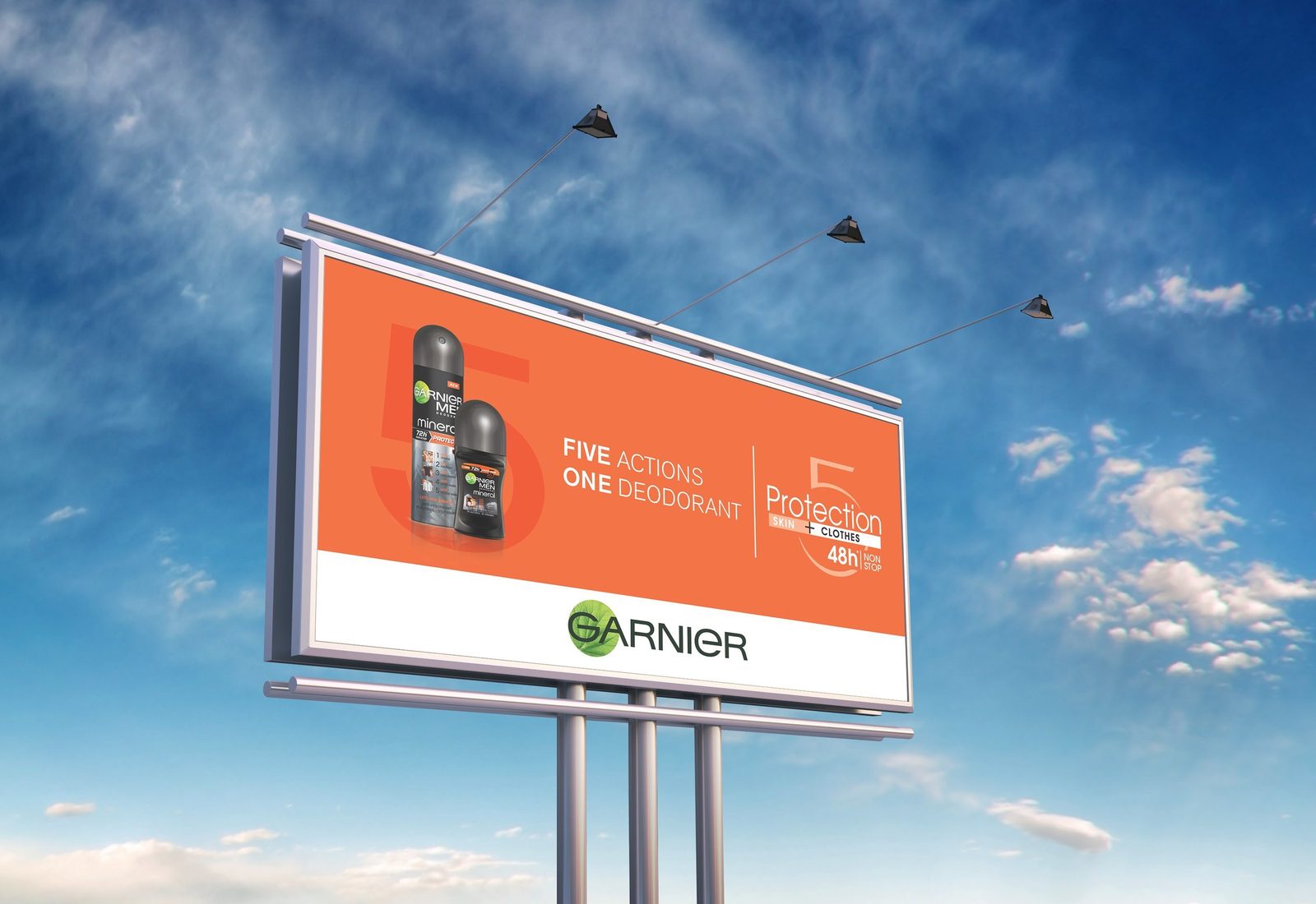
Protection 5 billboard, flighted across Bryanston and Sandton. One number, one promise, read at speed from a moving car.
Piece 3 · Print
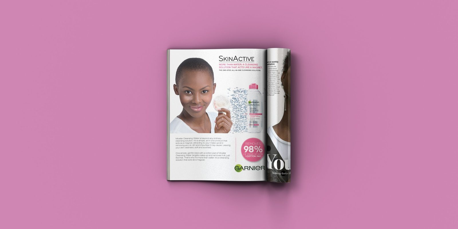
SkinActive Micellar Water, featured in Glamour. Beauty press demands craft at full-page scale, where every detail is under the reader’s eye.
Dark & Lovely
A brand book is the backbone of every successful brand, the document every future execution answers to. I had the honour of creating one for Dark and Lovely, setting the tone, visual identity, and creative direction for a new era of the brand.
Piece 1 · Brand book
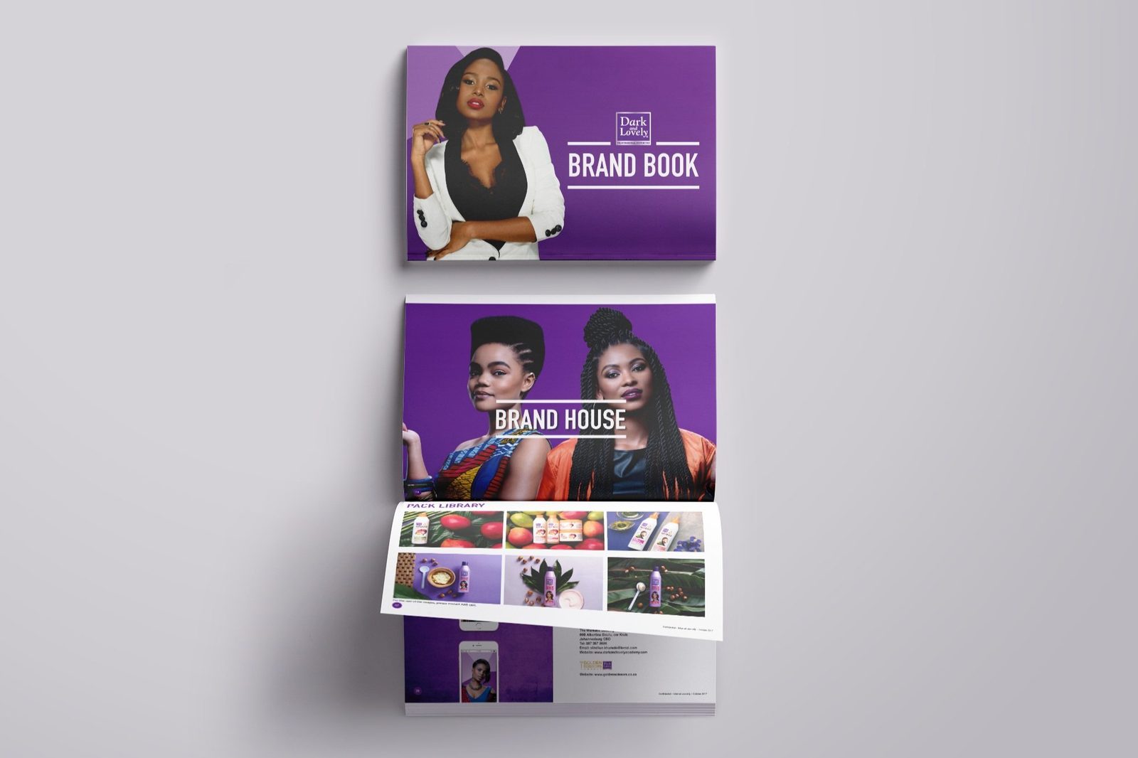
The brand book and brand house, defining how Dark and Lovely looks, speaks, and shows up, down to the pack library that keeps the range coherent across every product.
Huawei Retail
Print and point-of-sale across the retail store network, spanning devices, wearables, and seasonal campaigns. Retail design is discipline at scale: one system, many products, every poster pulling its weight on the shop floor.
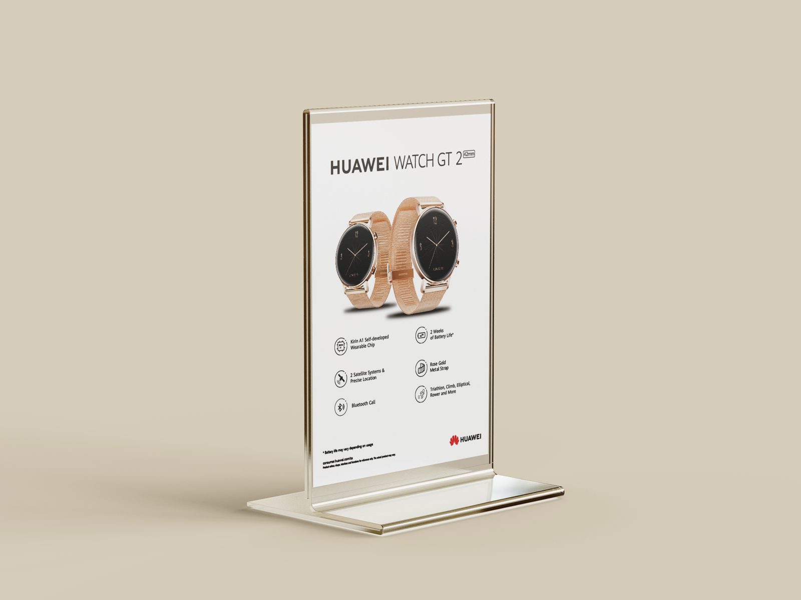
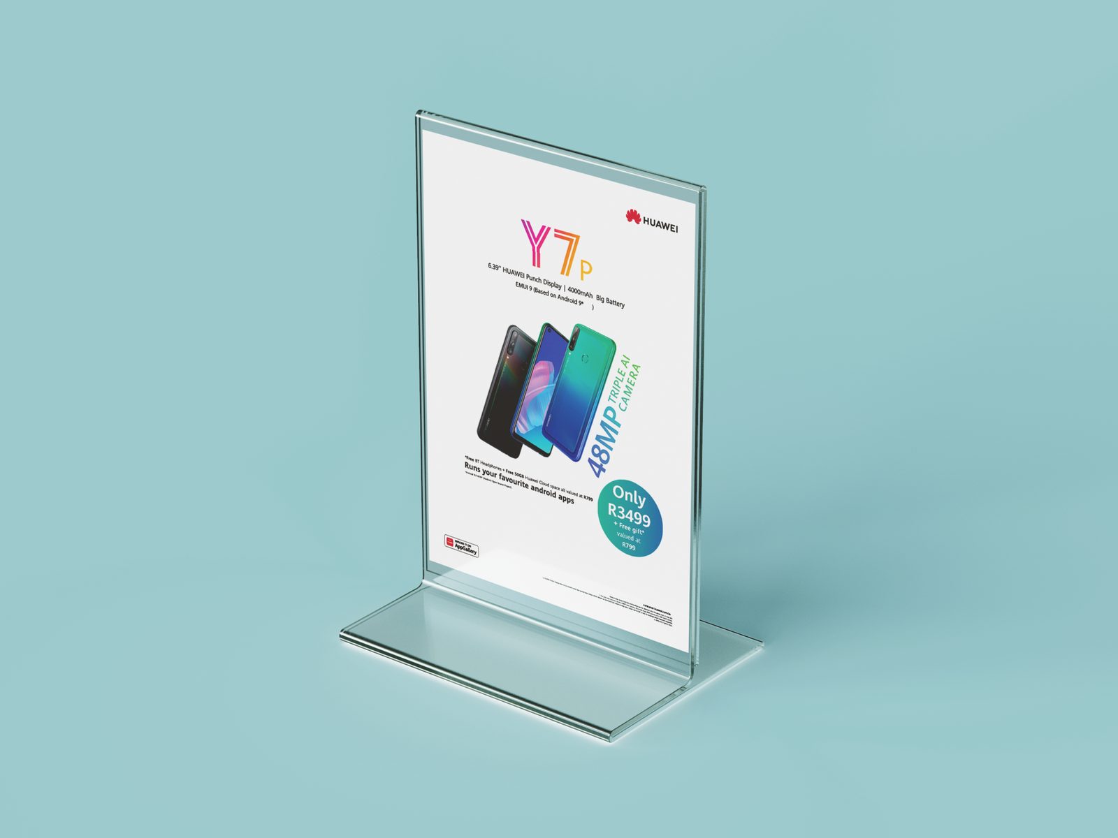
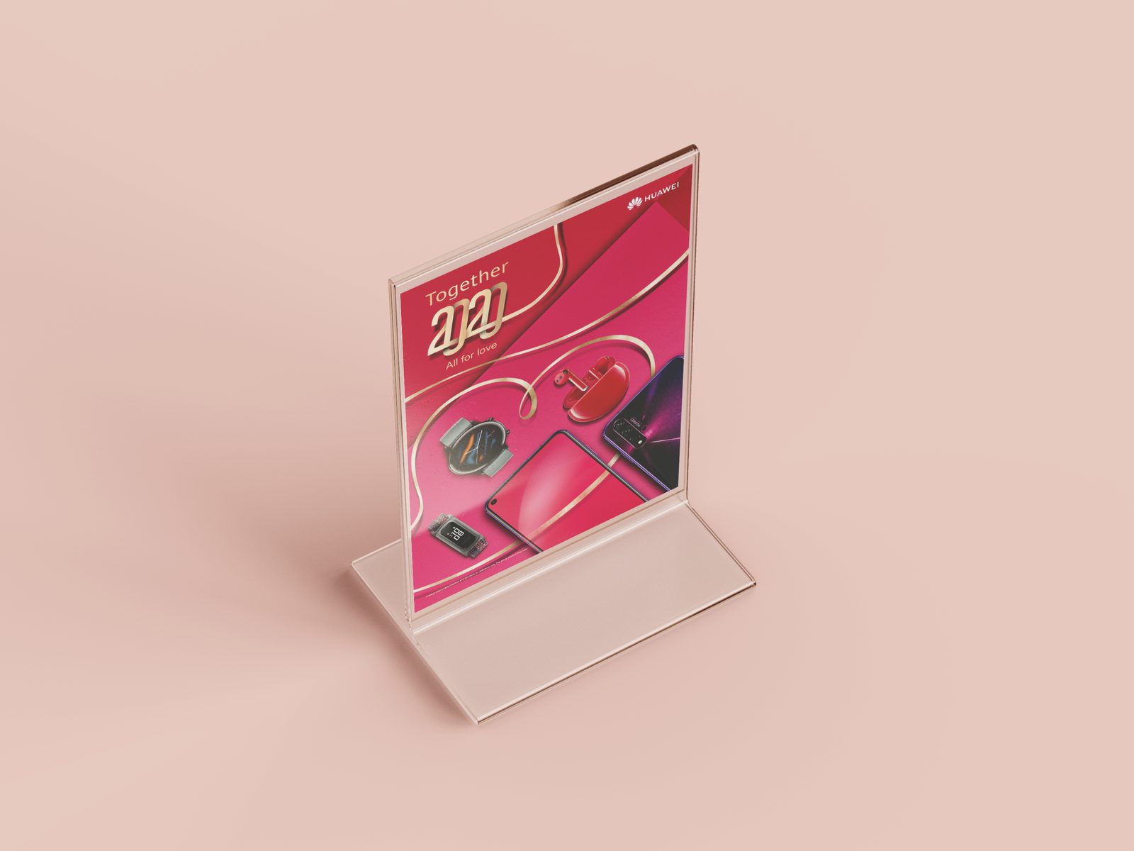
Watch GT 2, Y7p, and the Together 2020 festive campaign, produced for in-store display across the network.
Auto Pedigree
I created and guided the look and feel for Auto Pedigree across social, building a consistent visual language for an always-on used-car account that had to feel approachable, local, and trustworthy.
Piece 1 · Social campaign
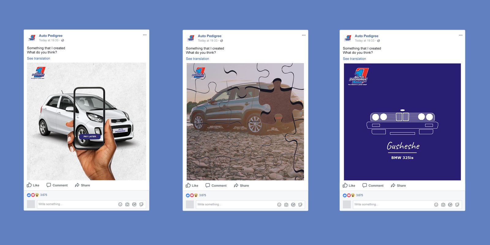
A run of social creative built for the feed, from a buy-now-pay-later mechanic to the Gusheshe heritage piece that taps straight into local car culture. Watch the campaign film.
SANRAL
Public-service communication for the national roads authority, where the work has to inform without lecturing. The Travel Safe campaign turned festive-season road safety into something people would actually engage with, across a microsite, social, and on-the-ground digital.
Piece 1 · Travel Safe microsite
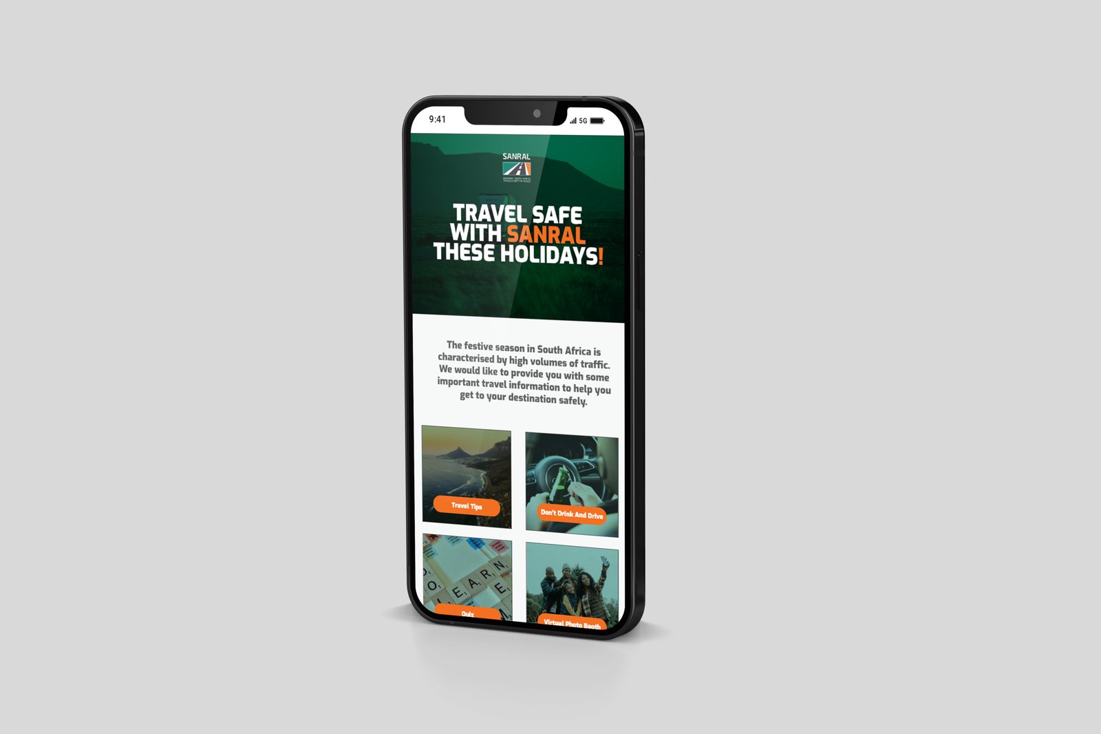
A mobile-first microsite built around the festive travel rush, bundling travel tips, a don’t drink and drive message, a quiz, and a virtual photo booth into one experience. Utility and engagement in the same place, so a safety message earns its own audience.
Piece 2 · Digital activation
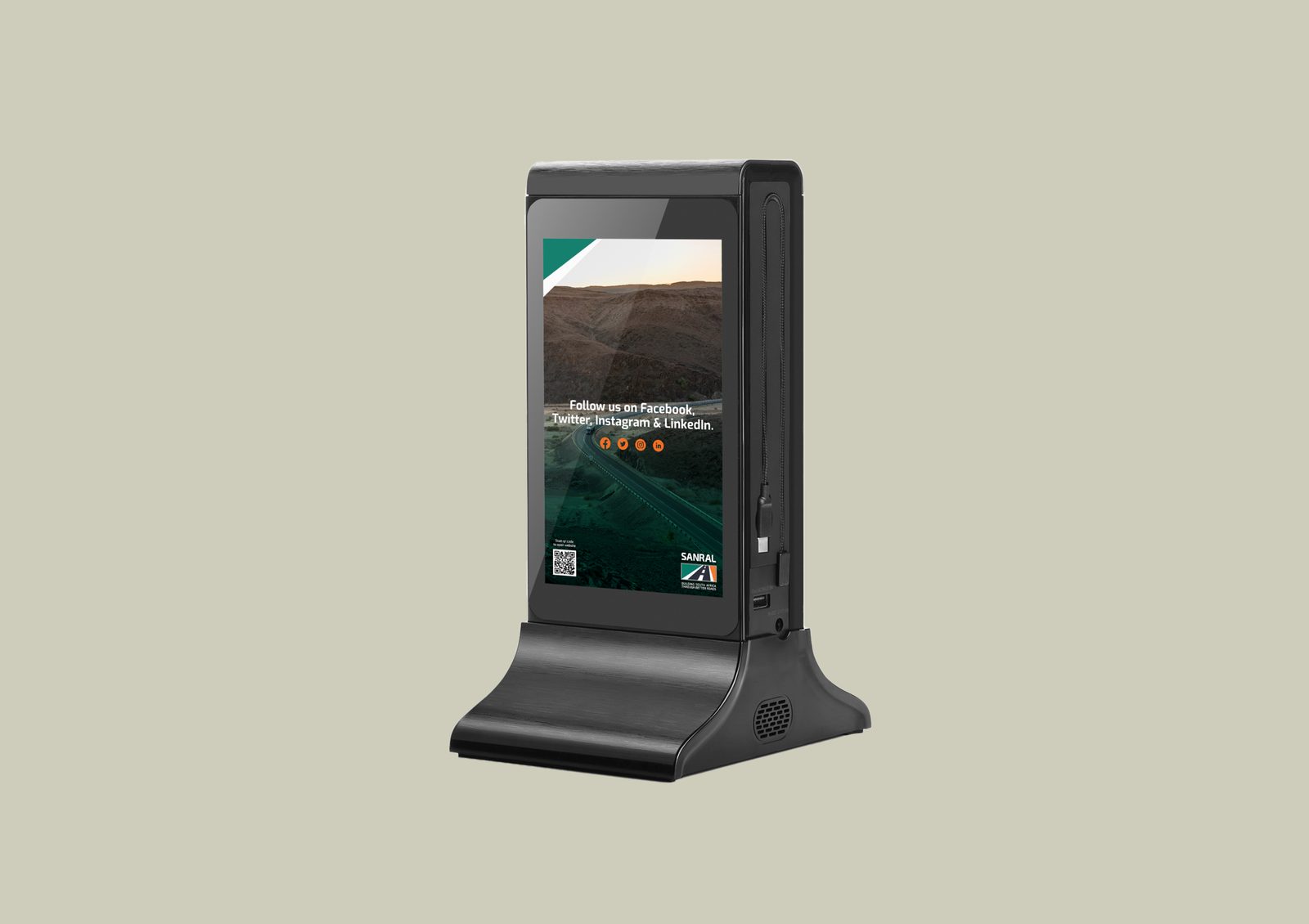
On-the-ground digital screen driving follows and scans, closing the loop between a physical touchpoint and the campaign’s online home.
SA Medical Association
I conceptualised and created the brand book, corporate stationery, and art direction for all photography and videography for the SAMA fitness brand, building the identity from the ground up.
Piece 1 · Brand guidelines
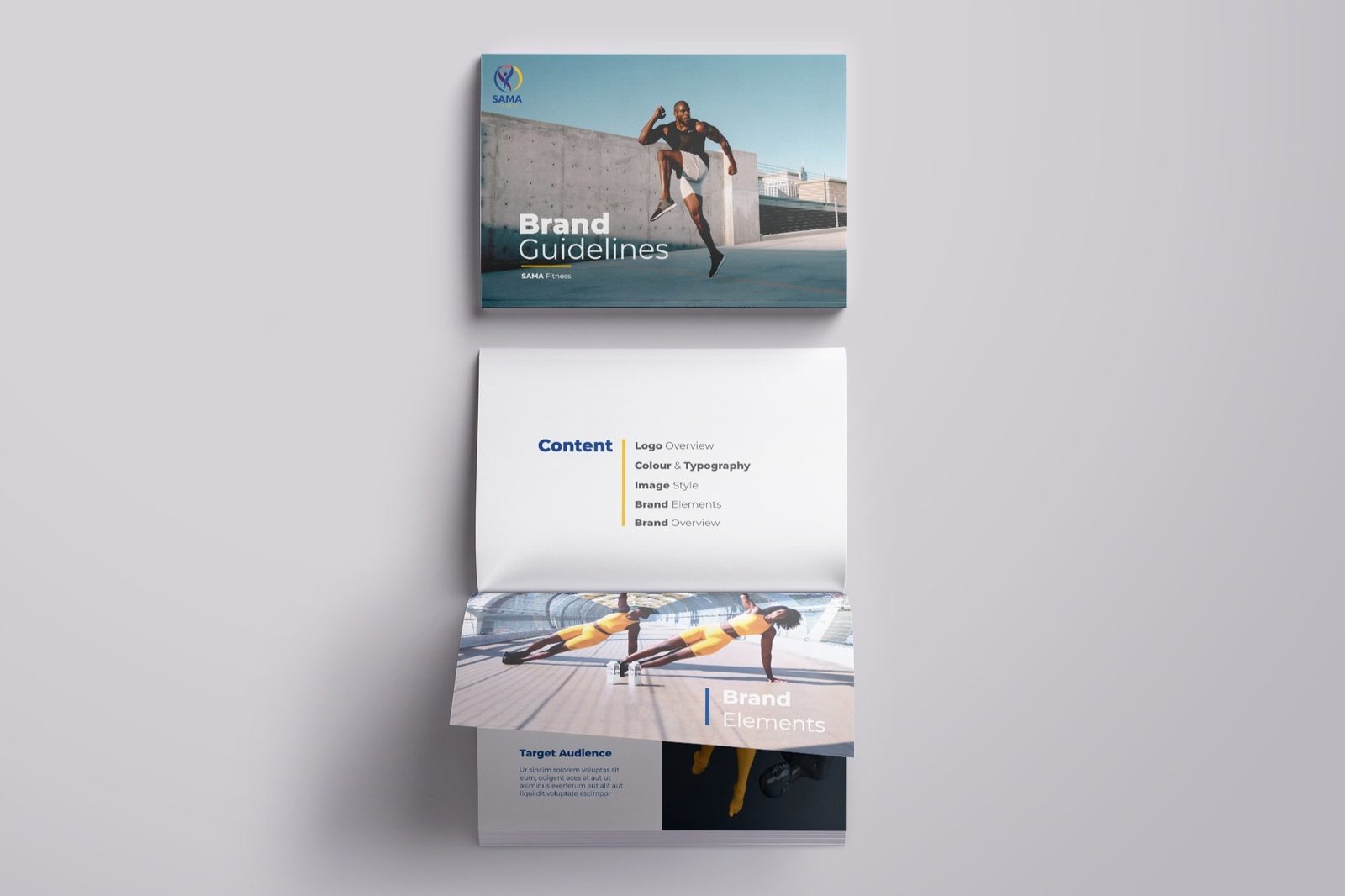
Guidelines covering logo, colour, typography, image style, and brand elements, the rules that keep everything that follows on-brand.
Piece 2 · Stationery
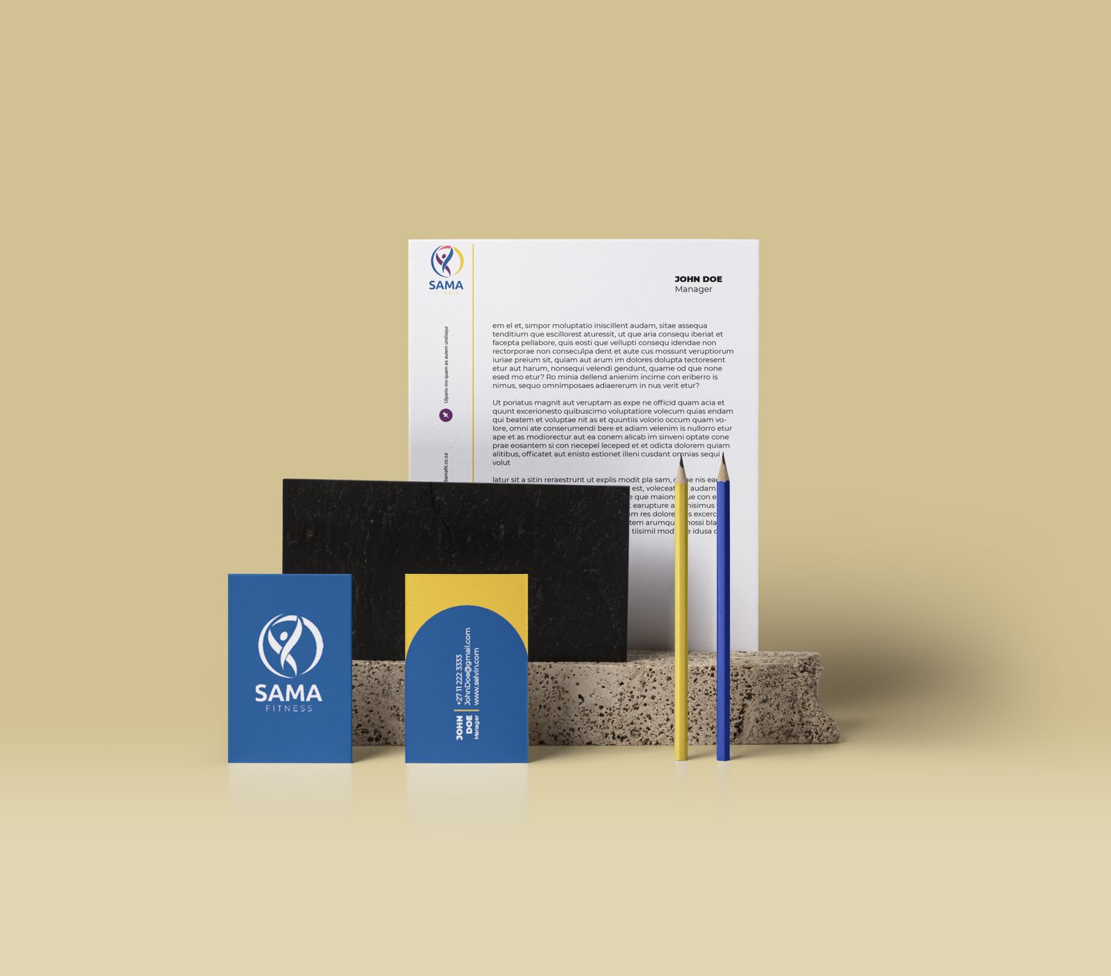
The corporate stationery system, where the identity has to work at the smallest, most practical scale.
Piece 3 · Out-of-home
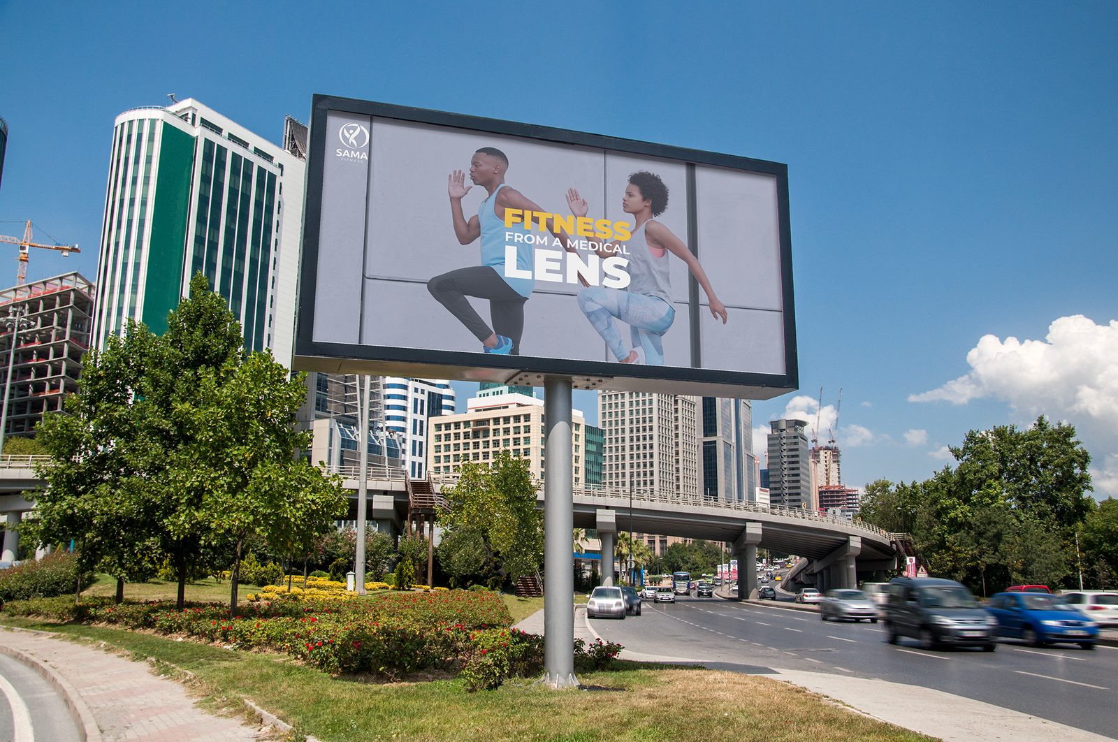
Fitness from a Medical Lens, the campaign line carried to billboard, art-directed end to end.
Published writing
Thinking
on the record.
Strategy, culture, and brand thinking. Published on BizCommunity and The Media Online.
What Spider-Man just taught marketers about digital strategy.
Sony's Brand New Day broke the record for the biggest promotional partner campaign in Hollywood history. The mechanics behind it are worth studying whether you work in film or not.
Youth Marketing · BizCommunityDecoding Gen Z: The first post-brand generation.
SA marketers confronting an uncomfortable truth: their most valuable future consumers do not trust them, do not watch their ads, and do not care about their brands.
Cultural Marketing · BizCommunityDrake dropped. Brands scrambled. But one nailed it.
When Drake dropped three albums on the third Friday of May, SA brands responded predictably. One big media brand had to quietly delete their post.
Culture and Strategy · The Media OnlineThe backroom beat that shook the world.
Gqom grew 5,732% on Spotify since 2018. What every marketer can learn from the unstoppable rise of a genre no brand commissioned, no focus group validated, and no label created.
Culture and Strategy · BizCommunityThe backroom beat that shook the world.
What every marketer can learn from the unstoppable rise of Gqom. Authentic culture starts in communities, not boardrooms.